Norfolk Flood Risk Center – Civic Microsite Design
City of Norfolk, VA - Local Government
Problem
The City of Norfolk partnered with Civis Analytics to help residents understand their flood risk more easily. Civis handled data hosting and cleanup, and I was responsible for designing a responsive, public-facing microsite that allowed residents to look up their address and learn what flood zone they lived in—along with insurance suggestions. While I didn’t author the content, I made key language recommendations to improve clarity, which were approved by the client. The overall challenge was to present complex data in an accessible, easy-to-understand format, while meeting WCAG standards and supporting users across a wide range of literacy levels.
Results
I delivered a responsive microsite that met WCAG 2.1 AA standards and translated complex flood data into clear, actionable insights. The design included a fully accessible UI, literacy-informed language, and A/B tested content that helped users better understand their flood zone status and next steps. I collaborated with a developer to bring the site live, ensuring front-end fidelity and responsive behavior. While some features remained in progress due to data coordination delays with the City of Norfolk, the launched version successfully supported address-based lookups, insurance suggestions, and gave users the ability to download a personalized PDF summary of their results. Usability testing confirmed the site was easier to use than comparable civic tools, and feedback highlighted its clarity and approachability.
My Role
UI/UX Design, Accessibility, Research & Testing, Literacy-Focused Content Strategy
Target Audience
Residents of Norfolk, VA (renters and homeowners) and the City of Norfolk government


A/B Testing, Accessibility & Literacy Strategy
Conducted usability testing with six participants using real-world scenarios, including A/B testing of layout variations. Participants preferred vertically stacked layouts for clarity and ease of scanning. This led to updates like converting the “Do you rent or own?” and “Do you have flood insurance?” questions from horizontal to vertical format, with the second question revealed conditionally after selecting the first—reducing visual clutter and guiding the user step by step
Feedback highlighted confusion around terminology in the “Baseline Knowledge” and “Flood Zone” sections; while the content language remained unchanged, these findings informed a client-approved plan to add a supporting FAQ page to address common user questions and reinforce user understanding
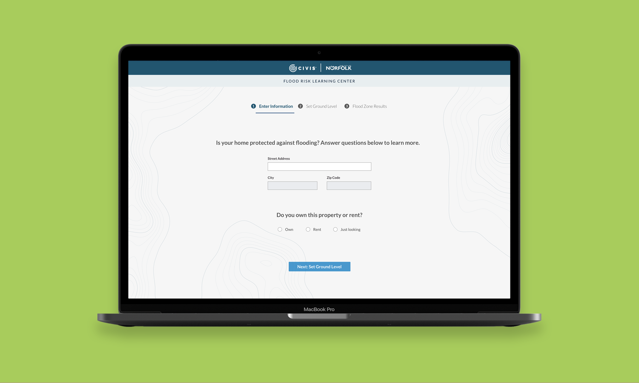
Used visual hierarchy, spacing, and layout structure—including a step indicator and simplified input fields—to support clarity, reduce cognitive load, and guide users step by step through the experience
Revised the address input field from a single field to three distinct fields—Street Address, City, and Zip Code—to improve accessibility, reduce user friction, and support assistive technologies

Visual Design System & UI Components
Balanced Civis Analytics and City of Norfolk branding across the interface to reflect joint ownership while maintaining a clean, uncluttered hierarchy
Designed a cohesive set of UI components, including buttons, tooltips, hyperlinks, radio buttons, input fields with error states, and a step indicator—ensuring visual consistency and ease of use across the experience
Defined consistent spacing rules, text styles, and alignment behavior to establish a readable, scannable structure that supported user flow and minimized ambiguity
Applied WCAG 2.1 AA-compliant color contrast across all elements to ensure accessibility for low-vision users and clarity under various lighting conditions
Built modular layout elements that could flex across screen sizes and be reused or extended for other civic projects—ensuring the system’s longevity and adaptability beyond this microsite

“This project deepened my understanding of how accessibility, literacy, and civic design intersect. I learned how to listen for confusion in user feedback and respond with clear, intentional language—translating technical terms into guidance that empowers users to take action. It also pushed my systems thinking beyond interface design, into how content, layout, and structure support users in high-stakes, real-world scenarios. Working with a developer to launch the site—and navigating delays with municipal data—taught me how to advocate for clarity and progress even within the slow-moving realities of civic projects.”
— Reflections