
Bridging UI Design and Systems Documentation
Civis Analytics - Data Science, Public & Private Sector | B2B
Problem
Civis Analytics needed a flexible, modern redesign of its marketing website—one that could be handed off seamlessly to an external development partner in the absence of a dedicated engineering team. I was tasked with designing 10 new web page templates and creating interactive UI documentation to guide implementation. The challenge was to deliver scalable, responsive design with system clarity—without access to a live design system or direct engineering collaboration.
Results
I delivered 10 fully redesigned webpage templates and a scalable documentation system that provided clear guidance on layout, spacing, component behavior, and responsive interaction. This system gave the external agency a single source of design truth—reducing friction, accelerating development, and ensuring the final site launched with visual and behavioral consistency.
Branding | Visual Design | UI/UX
UI/UX, Web Design, Mobile Design, Design Systems, Branding and Design Audit
Target Audience
External engineering vendor team and internal marketing/product stakeholders at Civis Analytics


CTA Buttons & Behavior (UI Guide)
Defined primary and secondary CTA sizes, spacing, and color states across desktop and mobile
Specified interaction logic for buttons that anchor to on-page content versus those that navigate to separate pages
Included character limits and guidance for text hierarchy to support consistency across modules
Created visual samples to illustrate button use across hero banners, forms, and mid-page modules

Client & Employee Scroll (UI Guide)
Adapted the horizontal scroll layout to support hover interactions that reveal employee bios
Outlined visual behavior for image-to-text transitions, including fade and overlay logic
Defined spacing, font styles, and card structure for both client and employee content types
Provided clear design guidance for presenting bios within scrollable sections in a consistent format
Created a visual spec to align layout with client brand elements and maintain modular consistency

Let’s Chat Forms (UI Guide)
Designed the layout for the “Let’s Chat” conversion module used across multiple pages, including consistent spacing and alignment
Designed the form to be responsive across breakpoints—adjusting outer container width and padding while maintaining consistent input, font, and button sizing
Documented dropdown behavior and outlined interaction flow for standard form inputs
Coordinated with the external development team to ensure the form connected properly to Pardot.
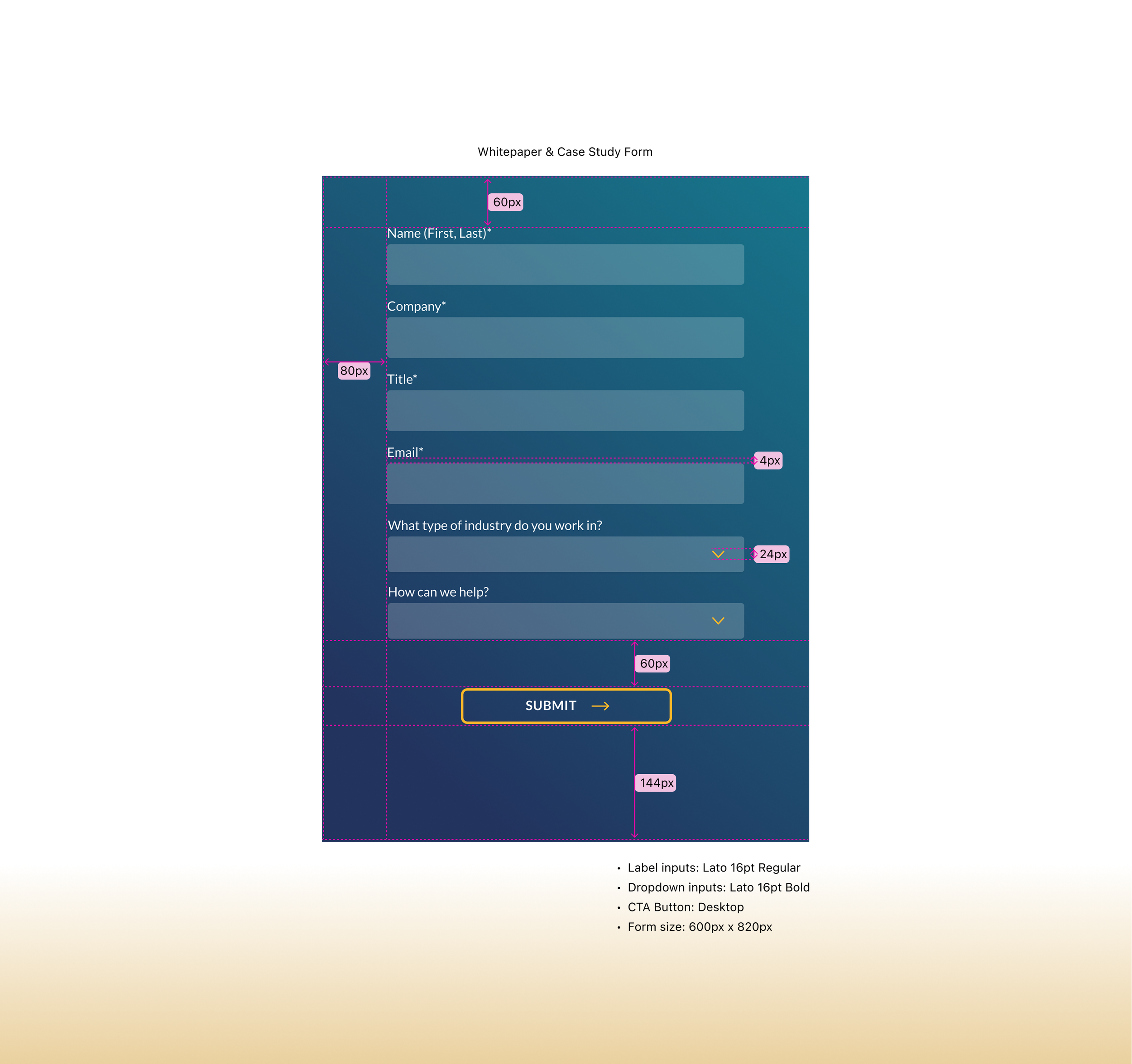
Whitepaper & Case Study Forms (UI Guide)
Adapted the base form layout for gated whitepaper and case study downloads, maintaining consistent styling across use cases
Optimized form layout across breakpoints by scaling outer containers and spacing while maintaining consistent input and button sizing
Clarified interaction flow for the “Submit” action and supported gating behavior (e.g., sign-up before access)
Coordinated with the development team to ensure forms were properly connected to Pardot

Popup Forms (UI Guide)
Created specs for modal-based forms triggered by CTAs or page entry/exit behavior
Defined responsive behavior for modal width and padding across screen sizes, while preserving uniform input, font, and button styling
Ensured visual continuity with inline forms while adapting to overlay use cases.
“This project sharpened my ability to design with developer empathy and systems foresight—especially in a resource-constrained environment. It reinforced that scalable design isn’t just about reusable components, but also about clearly communicating structure, hierarchy, and behavior across teams. The Civis project became a bridge between marketing, design, and engineering—and a reflection of my ability to lead systems work, even in the absence of a formal design system.”
— Reflections