Design Systems Case Study: Scalability & Accessibility
CVS Health - Pharma & Healthcare | B2B + B2C
Problem
The existing web design system lacked cohesion, making it challenging for cross-functional teams to design and build with clarity and consistency. From a UX perspective, unclear patterns and incomplete documentation led to misalignment across teams. Several components required visual and functional refinement, some lacked key accessibility features, and others needed to be built from the ground up to support evolving workflows and use cases.
Results
I addressed these challenges by resolving visual and technical bugs, closing functional gaps, and introducing net-new patterns that were accessible, consistent, and scalable. As a result, adoption increased across 10+ internal product teams, while developer reliance on design workarounds dropped significantly—contributing to an estimated 30% reduction in component-related support tickets. The system successfully passed internal WCAG 2.1 AA audits, giving teams greater confidence in accessibility compliance. With improved documentation and token alignment, developers were able to implement components more efficiently—laying a strong foundation for responsive and future-ready design.
My Role
Design System Strategy, UI/UX Design, Accessibility & Developer Collaboration, Documentation & Scalable Implementation Guidance
Target Audience
Internal Product Teams (10+) and End Users engaging with consistent, accessible product experiences
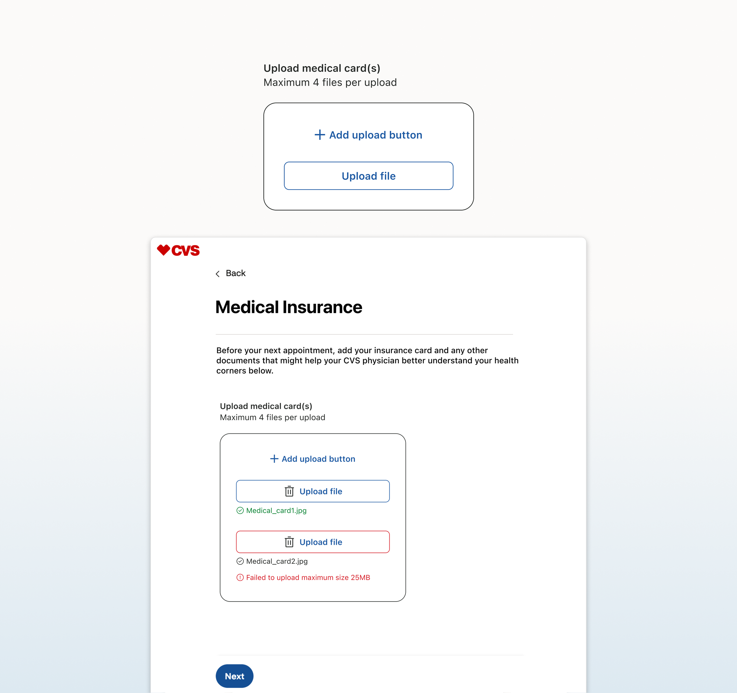
File Input (Net New)
Designed a scalable file upload pattern supporting 1 to 4 files per instance, with dynamic UI behavior that adapts based on user actions and file states.
Defined visual states for default, hover, error, disabled, and success—each styled using system tokens to support clarity, accessibility, and consistent behavior across the system.
Included contextual status and error messaging to provide clear, accessible feedback during file upload and validation events.
Image preview was intentionally excluded based on infrastructure constraints and user research findings that showed it added limited value to the upload experience.
Developed with custom styling to bypass native browser defaults, creating a more consistent and seamless user experience across browsers and platforms.
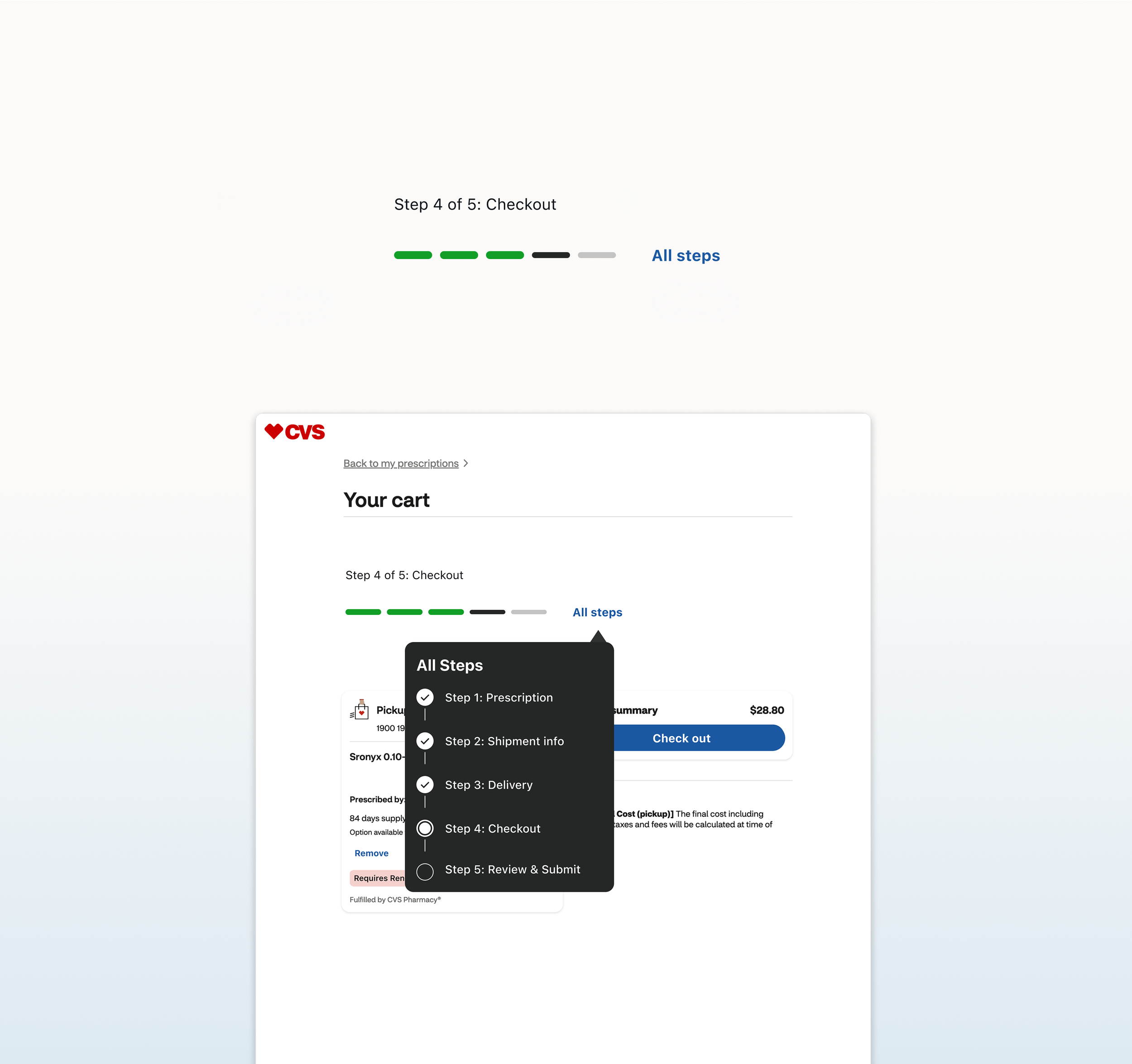
Step Tracker (Net New)
Designed a responsive web version to align with native behavior while supporting system-wide consistency across platforms.
Implemented responsive logic with a max width of 640px for 1080px layouts, allowing for smooth scalability across breakpoints.
Differentiated completed and active steps using both color and height to improve visual affordance and accessibility for users tracking multi-step flows.
Introduced built-in constraints—supporting a max of 3 to 6 steps with a 10-character minimum per label—to maintain layout stability and create a consistent pattern within the design system.
Positioned infotip labels using absolute logic, allowing them to remain anchored to their respective step buttons across responsive breakpoints.
Configured Figma build with nested properties, enabling flexibility across several key variants: default view (visual steps only), all steps with infotip, visual step states (complete, current, incomplete), infotip arrow direction, and infotip state styles.

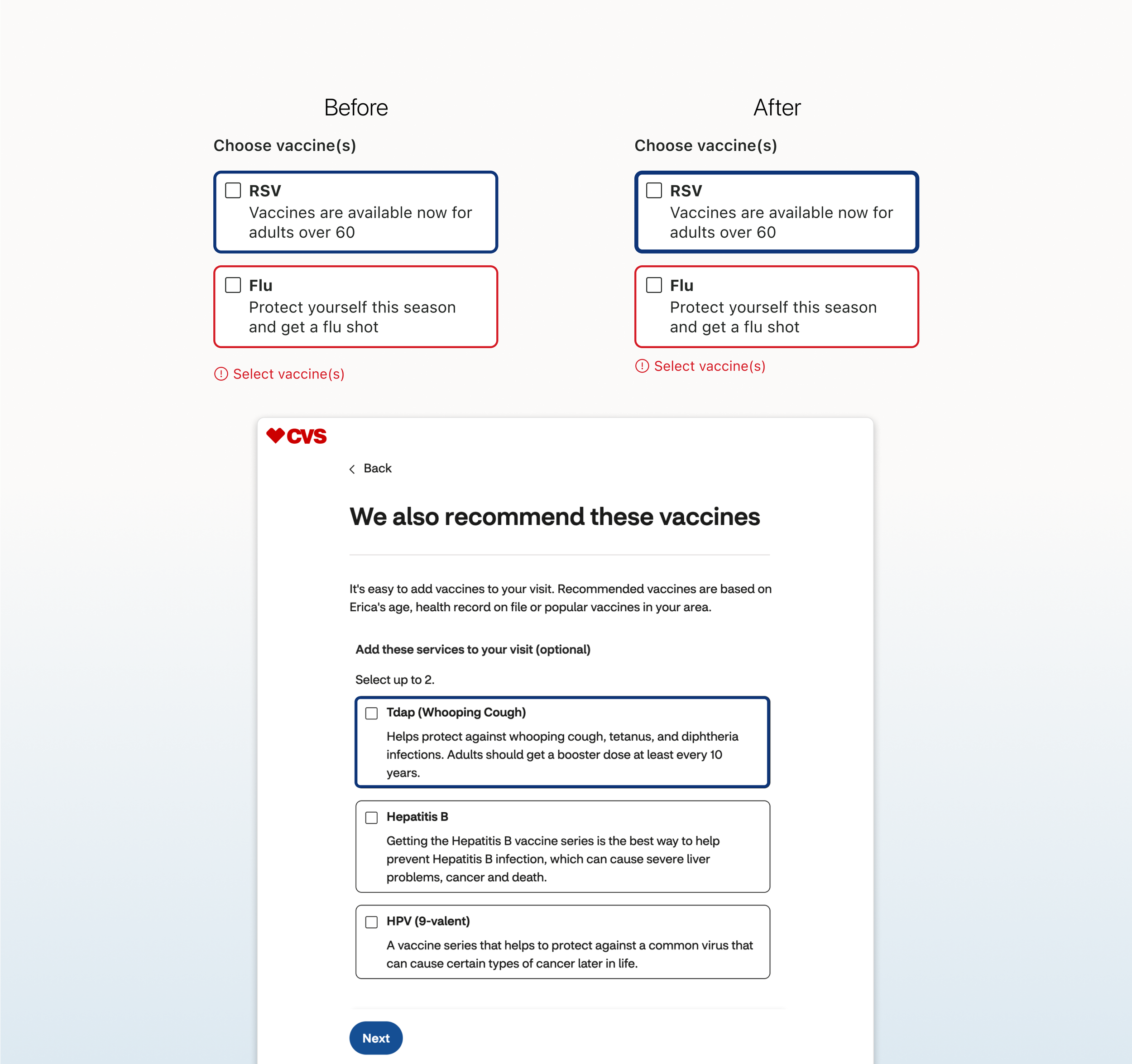
Custom Radio (Accessibility + Token Updates)
Increased the border thickness for selected and hover states from 3px to 4px to improve visual affordance for accessibility—particularly within group error states where the selection was previously unclear. This update also aligned with current design token values for consistency.
Replaced deprecated error icons with updated iconography to match the system’s current visual language.
Added missing text slots to all disabled states within the vertical and horizontal single radio components, improving design clarity and ensuring consistent guidance for content entry.
Adjusted error message padding from 16px to 8px to align with system spacing tokens and maintain consistency across components.
Custom Checkbox (Visual Consistency + Accessibility)
Increased the hover state border from 3px to 4px to improve visual affordance for accessibility and to maintain consistency with the Custom Radio component.
Replaced deprecated error icons with updated iconography to align with the system’s current visual language.
Added missing text slots to all disabled states within the single checkbox component to support design clarity and consistent content entry.
Adjusted error message padding from 16px to 8px to align with system spacing tokens and ensure visual consistency across input components.
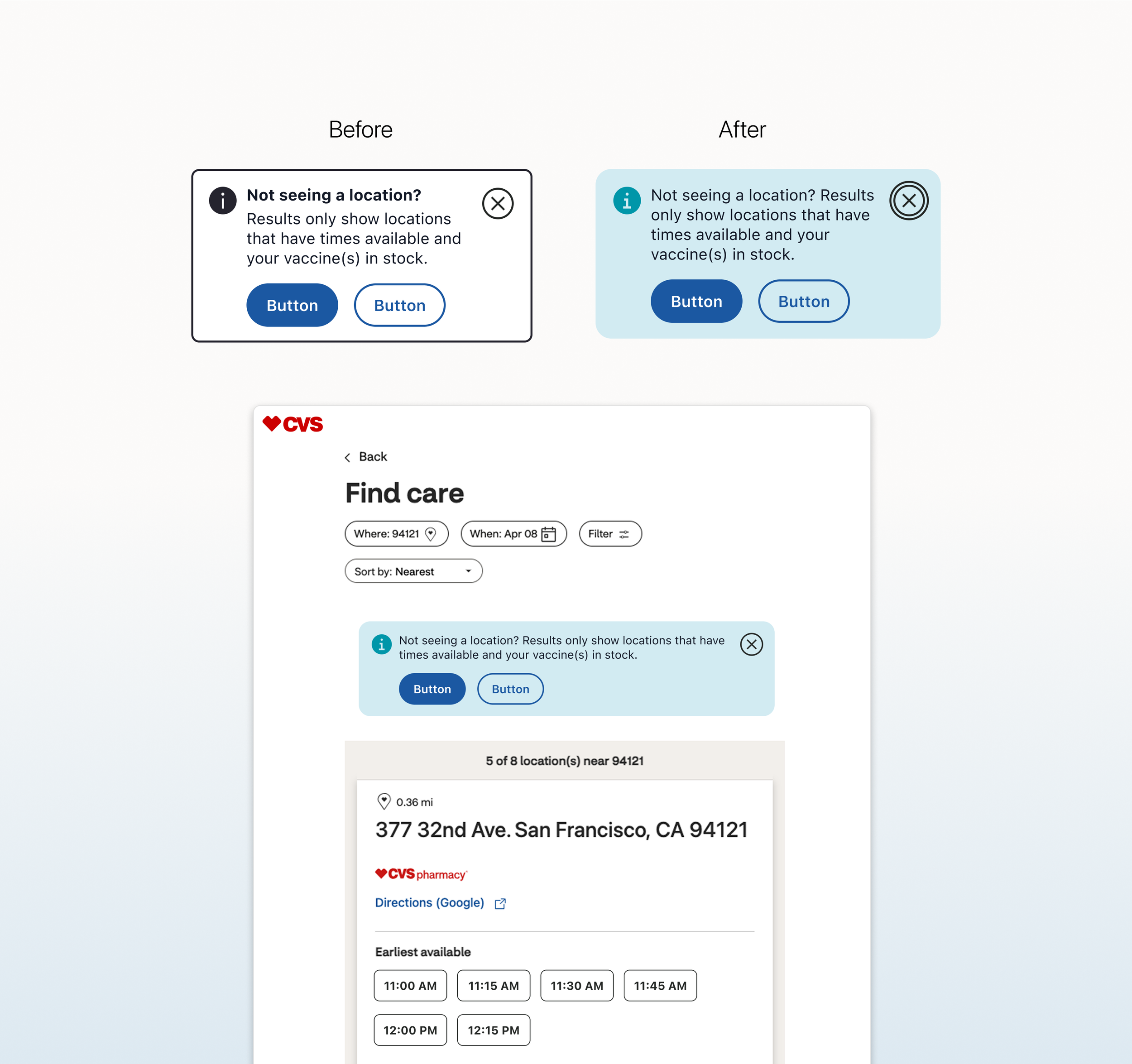
Important Note (Redesign + Alignment)
Introduced 16px rounded corners to align with native styling and ensure consistency across platforms
Replaced the close icon with a text icon button to support accessibility and leverage built-in focus states
Removed the header element to maintain a clear and semantically correct heading hierarchy
Added a full background color option to support a clearer visual hierarchy across varied use cases
Both Info and Warning states adhered to these new updates, ensuring consistency and enhanced accessibility
“This work helped bring clarity, consistency, and accessibility to CVS's design system while deepening my experience in component refinement, token logic, and developer collaboration. It reinforced the value of clear documentation, thoughtful edge-case handling, and collaboration across teams to create scalable solutions that support real-world use. I left this project with an even stronger understanding of how design systems evolve through small, intentional improvements that compound into lasting change.”
— Reflections